Twindo Rebrand
From Canvas to a brand we could own
Building a brand for spatial intelligenceFrom Canvas to a brand we could own
Canvas had strong product-market fit, but the brand had grown from a product feature rather than a deliberately built company identity. The generic name competed with Canva, Canvas LMS, and countless other products; the cube mark blended into the 3D-capture category; and the story remained focused on features while the business was expanding toward a broader spatial-intelligence platform.
As Marketing Design Lead, I led the visual side of the rebrand in partnership with marketing, product, product design, sales, leadership, and outside collaborators. I began with an analysis of the existing Canvas brand, the competitive landscape, and the needs of audiences ranging from individual designers and builders to technical and enterprise teams.
Research, workshops, and naming
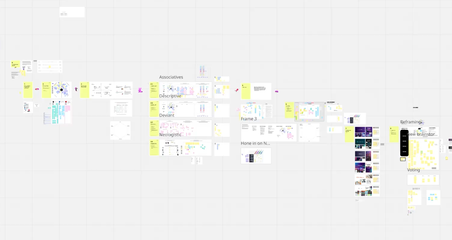
I translated that research into a structured series of brand and naming workshops. Together, we defined the brand’s position, personality, naming criteria, customer promise, and future scope. Rather than judging names as words on a slide, I developed visual territories far enough to pressure-test how each could live as a real company.
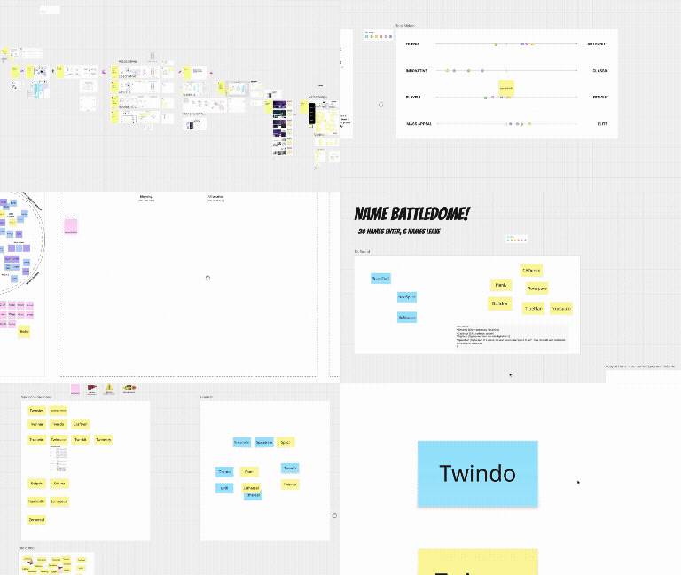
Twindo emerged as the strongest answer: an ownable name connected to digital twins, with “window” opening a clear visual metaphor. The final mark became a four-pane architectural window and device viewport—an invitation to look into a digitized space rather than another cube describing the technology.
Building the identity
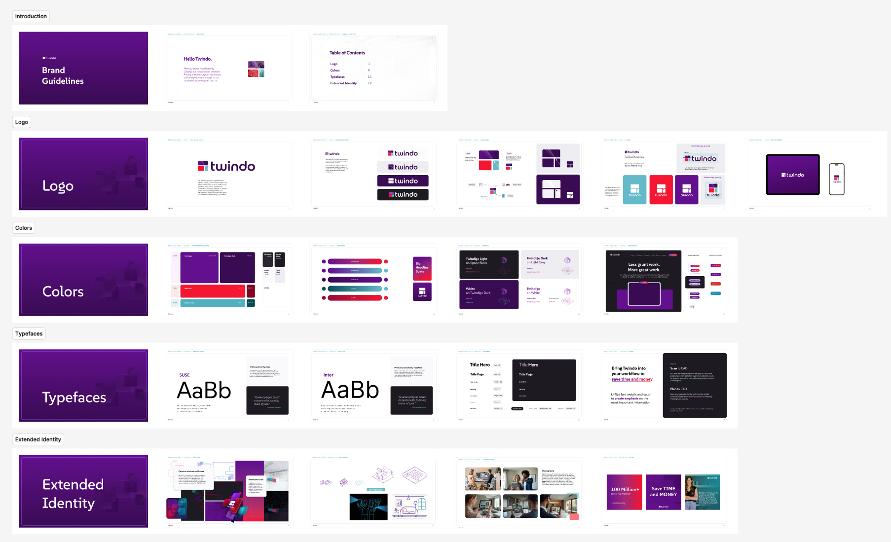
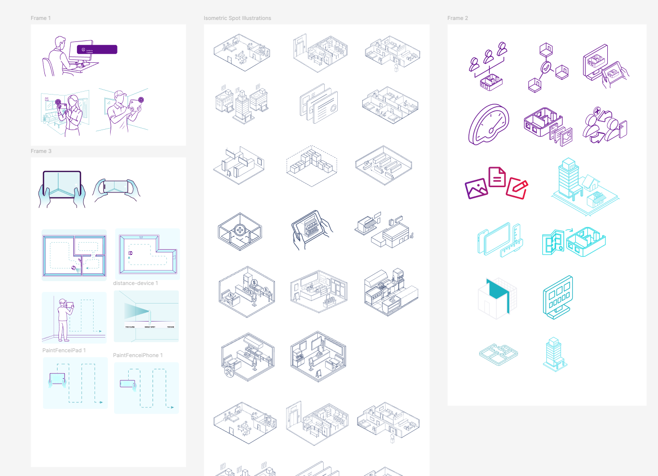
With the name selected, I developed the logo, color and typography systems, spatial grids, viewport motifs, image treatment, illustration direction, motion language, and application rules. The guidelines turned those choices into a system the whole company could use consistently.
I introduced Twindo internally before launch, explaining both the strategic reason for the change and the practical transition ahead. That all-hands announcement helped build company-wide understanding and buy-in while teams prepared their own customer touchpoints.
Turning a brand into a launch system
The rollout was far larger than a logo swap. I audited and prioritized dozens of assets across more than ten launch channels, separating day-one requirements from deeper phase-two redesigns so the company could launch coherently without blocking on every possible surface.
The shared presentation system became a major distribution tool: a broad grid of reusable sales, product, executive, webinar, and company layouts that let different teams build on-brand stories without starting from scratch.
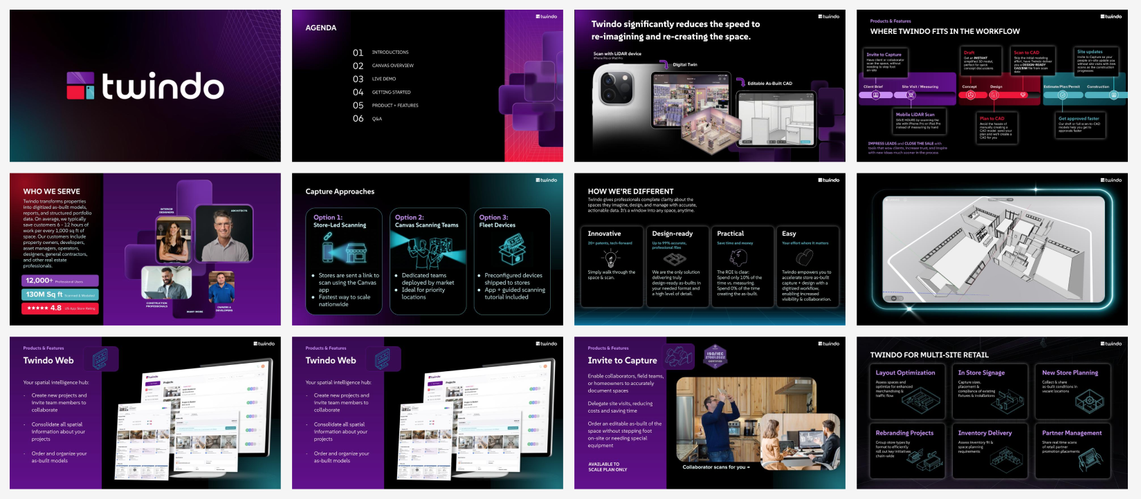
One coordinated company
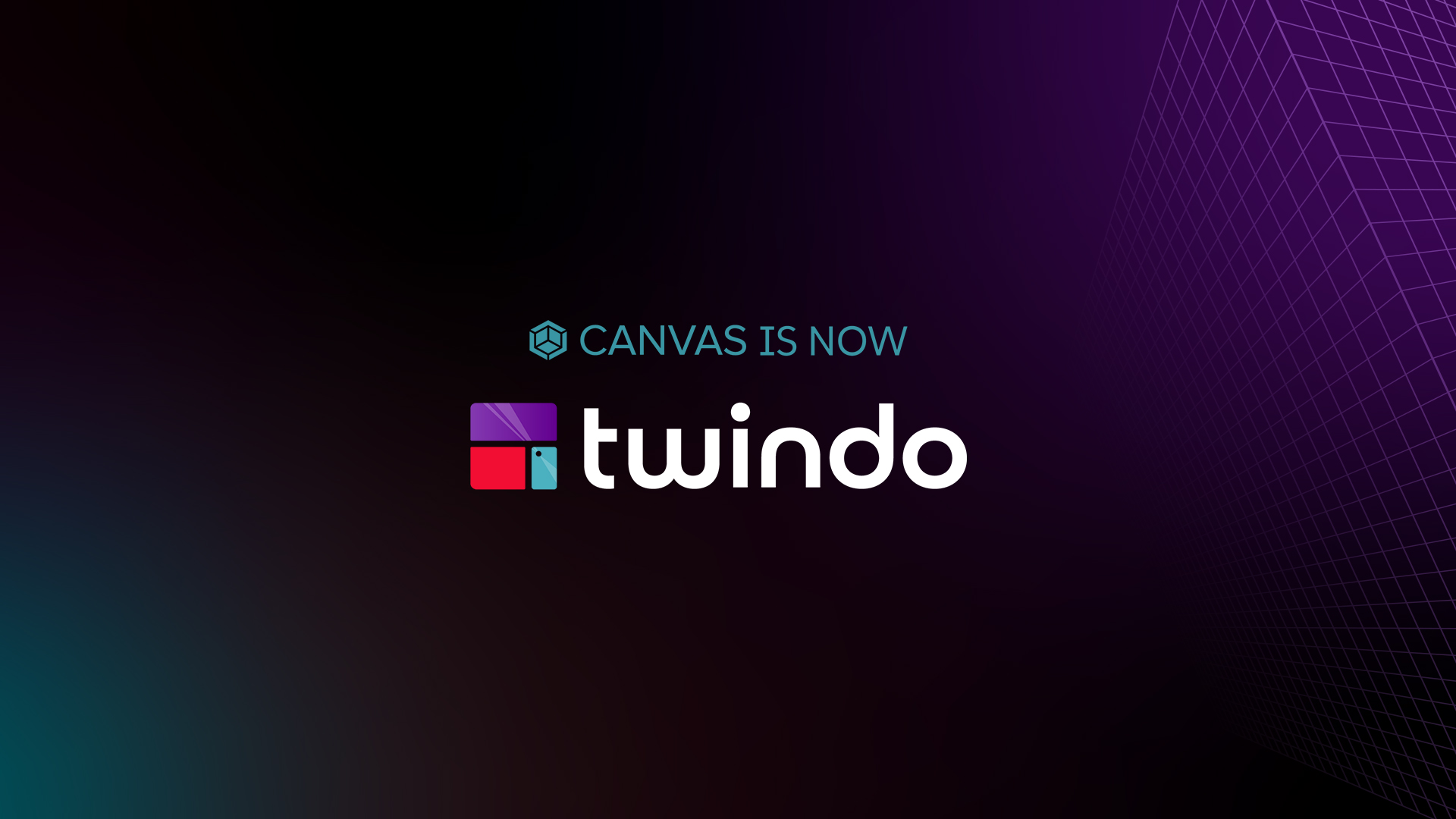
I worked across departments to carry the new identity through the website, product UI, app and app-store presence, sales deck, product storytelling, illustration library, email, social profiles and launch posts, paid media, one-pagers, event materials, and internal templates. Transition lockups such as “Canvas is now Twindo” preserved recognition for existing customers while steadily moving Twindo to the foreground.
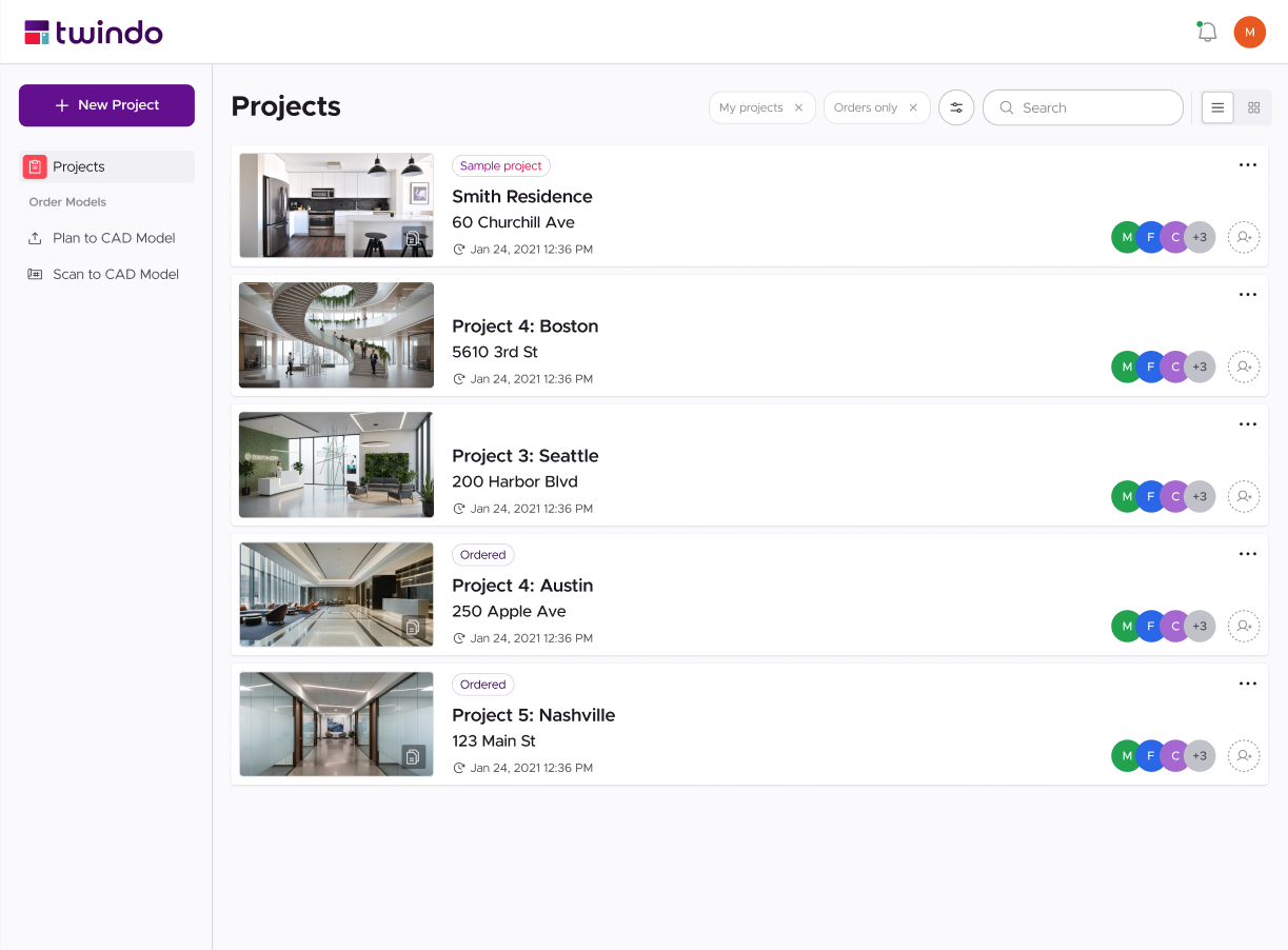

The final launch film brought the entire rebrand together. A real space becomes a scan, then a model, then usable spatial data; Canvas transforms into Twindo; and the new brand is introduced as a more connected way to capture, understand, and work with the built world.

