Rebrand & Launch · 2025–2026
Twindo Rebrand Launch
Canvas → Twindo: a company-wide rebrand from naming and identity through a coordinated, multi-channel launch.
Overview
Canvas had strong product-market fit and an unownable name. It competed for attention with Canva and Canvas LMS, so sales and support fielded a steady stream of inquiries meant for other companies. The cube mark described the technology and looked like every other product in 3D capture. The messaging was feature-led and accurate, and never claimed a position.
The constraint was the equity: twelve thousand professionals already had the app installed. Whatever replaced Canvas had to carry that forward rather than reset it.
As Marketing Design Lead, I partnered across marketing, product, design, sales, and leadership to guide the visual direction, from the naming study through to rollout.
Research
The work started with an audit rather than a sketchbook: where Canvas actually stood, and what the rest of the category already looked like. Mapping the direct CAD and capture competitors side by side made the core problem visible, everyone was describing the same technology in the same blues, and none of it was ownable.
Naming workshops
I led and researched a long series of brand and company naming workshops, working through positioning, personality, naming criteria, the customer promise, and a future vision before any name was on the table.
That produced six initial possibilities, each built out far enough to judge as a company rather than a word on a slide.
Back to the drawing board
We showed the six to leadership, and the decision was to keep going. So I built a much more rigorous second pass: a far wider candidate pool scored against the criteria that actually mattered, persuasive, memorable, distinctive, emotional, scalable, and protectable, with the reasoning written out next to every score.
Twindo came out of that analysis: twin plus window, describing the product and the picture at once, and nothing else in the category was called anything like it.
The mark
The old mark drew the thing being scanned. The new one draws the act of looking: a four-pane window with a lens in the corner, built from the same rounded rectangle as the iPad viewport people actually hold when they capture a space. It reads as architectural glazing, a camera frame, and a floor-plan grid at once.
Identity system
Three accents, each with a dark pair and a light tint, over four neutrals. Canvas Teal survives the rebrand as the secondary accent, partly for continuity and mostly because it is the right colour for the one thing the product does that nothing else does: overlay live scan data on a real room. One brand typeface and one product typeface, governed by a single rule, use weight contrast rather than more typefaces.
The guideline shipped in two editions: a full internal book covering patterns, illustration, photography and ad templates, and a trimmed external one with logo, colour and type for partners and press.
The brand, in motion
Launch execution
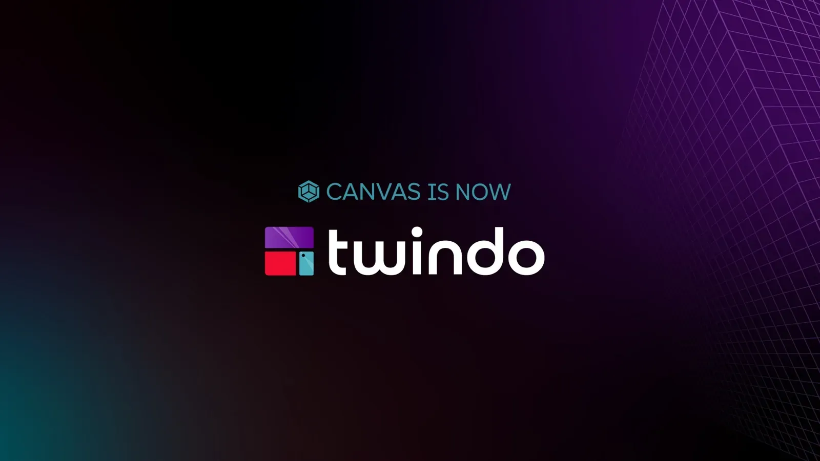
The hard part of a rename is not the reveal, it is the year afterwards when half the audience still searches for the old name. So the transition lockup was designed as a first-class asset rather than an apology: a Canvas is now Twindo version for the announcement, and a quieter formerly Canvas version that could live on paid units, print and email for months.
I audited and prioritized assets across ten-plus channels, separating day-one requirements from phase-two redesigns so the launch could be coherent without blocking on every surface. Customer quotes migrated verbatim with only the product name swapped, so the proof did not reset along with the brand.
The identity rolled through the website, product UI, app presence, sales materials, product storytelling, the illustration library, email, social, paid media, one-pagers, event materials, and internal templates.
The launch film
A launch film synthesized the whole rebrand: physical space becomes a scan, a model, then usable spatial data; Canvas transforms into Twindo; and the new brand positions itself as a more connected way to capture, understand, and work with the built world.
The logo was the smallest part of it
Put the two eras of the same sales sheet side by side and the rebrand stops looking like a visual project. Canvas sold three products on one general sheet with no pricing, in a voice pitched at an individual designer. Twindo sells six products across three market tiers and six enterprise verticals, with per-square-foot pricing printed on the page and a category claim in the headline.
That is the actual work: not a new logo, but a company deciding it was selling something bigger than an app, and every surface being rebuilt to say so.